
Word Frequency
Word frequency timeline (Wortverlaufskurve)
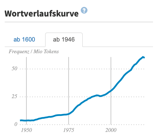
The Wortverlaufskurve is located at the top right of the word information page. It is a timeline graph that illustrates how the usage frequency of a word has changed over time. If you do a search for the word Herausforderung (or click this shortcut), you will see that it was used with increasingly frequency in the second half of the 20th century, and with an especially rapid increase in frequency during the 21st century. More specifically, the word appeared only 1-2 times per million words in 1945, and then the frequency increased to 30 per million around 2000 and to more than 50 per million after 2010. If you extend the time window to an earlier period by clicking on the ab 1600 tab in the top left corner of the graph, you can see that Herausforderung was first used at some point in the 18th century and that its popularity has been growing ever since. The word frequency (Worthäufigkeit) graph above the timeline, which uses a simple grading scale from seldom (selten) to frequent (häufig), shows that our search word is a relatively frequent one in the German language overall.
Now let’s try some additional examples. (Don’t forget to capitalize the nouns in your corpus searches!)
Detailed word frequency timeline view
If you find the images hard to read, you can go directly to the DWDS Corpus using the link provided below the images.
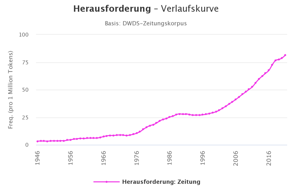
If you hover your mouse over the curve, a window will pop up showing the specific year, the relative frequency of the search word (per million words), and the absolute frequency. For example, we can see that in 1985, Herausforderung was used 718 times total or with the relative frequency of 23.18 times per million words.
This data comes from the post-1945 newspaper corpus. The target corpus can be changed in the Korpus pull-down menu in the expanded search functions at the top of the page. Further changes can also be made to the time window (Zeitraum) and other settings (Ansicht). Furthermore, the user can view and compare frequency timelines for different words. Clicking on the plus sign to the right of the search icon at the top of the page brings up a new search line. If we enter the word Problem in this line and then click the search icon, we can view two timelines in one plot.
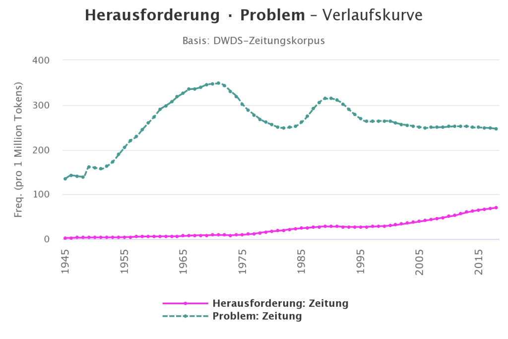
Comparing these lines, we can see that Problem has been used more frequently than Herausforderung since 1945, and that its usage frequency has also been growing over time, but with notable peaks and dips. Finally, one can print the graphs or export them to different file formats by clicking on the three line “hamburger” menu in the upper right corner of the Verlaufskurve window.
Now let’s try another example. Do a search for the word Laptop and use the resulting timeline graph to answer the following questions.
